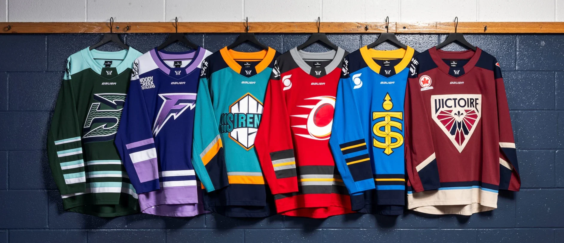
The Professional Women’s Hockey League dropped the reveal of the 6 teams’ sweaters, and while normally this would fall under Captain Sam’s purview, I’m stepping in to give some instant thoughts and rank them 1 through 6.
PWHL Jersey Reveals
1. Montreal Victoire
These are so clean you would buy that the team has been around ‘The City of Saints’ for decades, not going on year two. The color scheme doesn’t perfectly match the Habs but plays off the storied franchise’s rouge et blanc et bleu well. La Metropole is the clear 1 out of the six.
2. Boston Fleet
Am I the only one getting Hartford vibes? These honor the rich maritime history of New England, and the accents, down to the small waves within the jersey numbers, make them really crisp-looking.
3. New York Sirens
They went for a 90’s style logo and I don’t hate it (just wait til 5 and 6 for that). I will say the color scheme made me think of Brett Lindros (we got the right brother for a change) in those Gordon’s Fisherman Islanders jerseys from the mid-90s. The name is solid enough, sirens are ever-present in the New York Metroplex and a siren is an enticing, dangerous woman. These are the equivalent of a B- on a test to me. You’re not getting the belt, but it’s not going on the fridge either.
4. Minnesota Frost
The color scheme is solid and the obvious overlap with the Vikings seems like a no-brainer for success in the State of Hockey. So why so low? As my co-host said earlier tonight, “It looks like they used a create a team in franchise mode on NHL ‘24”. Listen it could’ve been worse, so, so much worse.
5. Toronto Sceptres
So. Here’s why you come to these kinds of posts. These jerseys are trash. They tried to do something and failed. The color scheme pops and it is the literal only positive. The name and logo look like they were trying way too hard. Don’t get it twisted, I’m not knocking the empowerment of women angle with the name. I’m saying you could’ve picked almost ANY OTHER empowering name and subsequent logo and it would be better. The logo is a pedantic ‘T’ and ‘S’ interwoven together into, you guessed it, a regal-looking scepter. You had one shot at a first impression and you spilled your Double-Double from Timmy Ho Ho’s all over me. I hate it.
But.
At least they put an effort forward.
6. Ottawa Charge
Holy shit you had one job! The effort put into this is equal to the effort in the reveal video. Both are a wet fart in church and now octagenarians are staring at you because you shit yourself during communion. It looks like they bought a truckload of error jerseys that weren’t up to par for the Flames out in the Saddledome. How soon can you rebrand in a league that’s entering year two? Three jerseys in three years has never been done before… Make some fucking history Ottawa, because these are worse than those mustard Nashville Predator alternates from the late 90’s (IYKYK).
I’m sure Captain Sam will read this and immediately have a bone or six to pick with me, which I look forward to arguing about on a future episode where you’ll all be treated to the dulcet tones of me screaming when she throws hot Canadian coffee in my lap.
Do you agree with these rankings of the PWHL Jersey reveals? Let us know in the comments below how you’d rank these jerseys or hit us up on Facebook, Instagram, Twitter, or TikTok.

